AMIKA PACKAGING
- Illustration
- Packaging
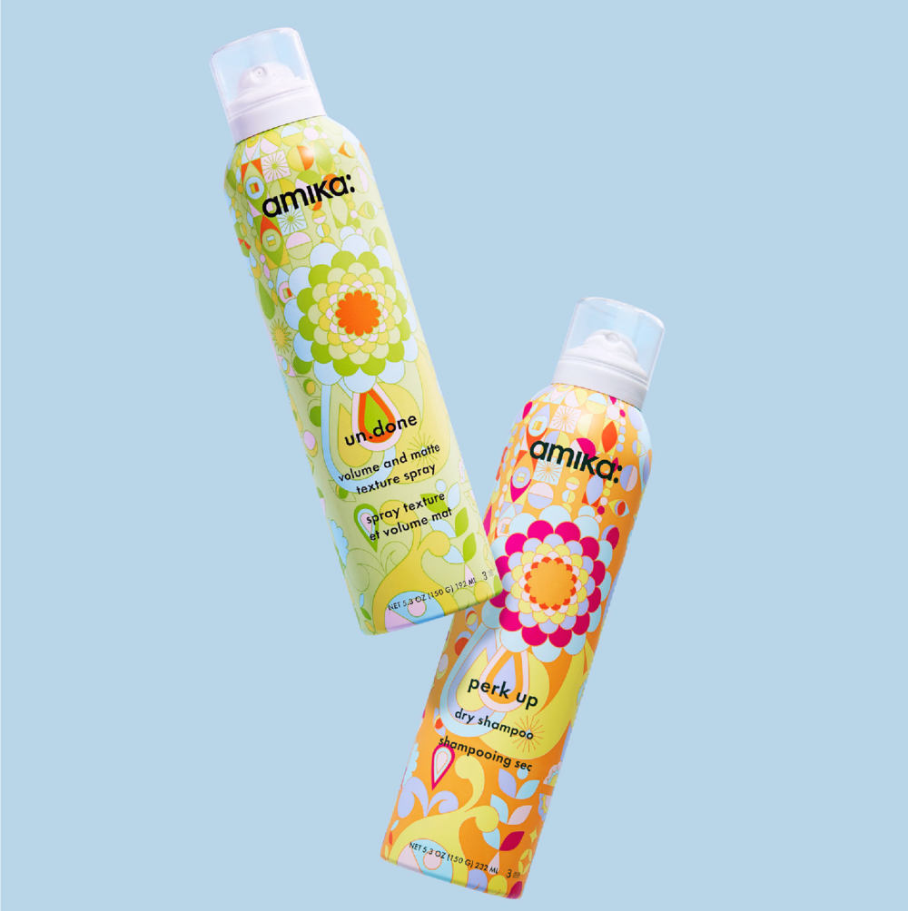
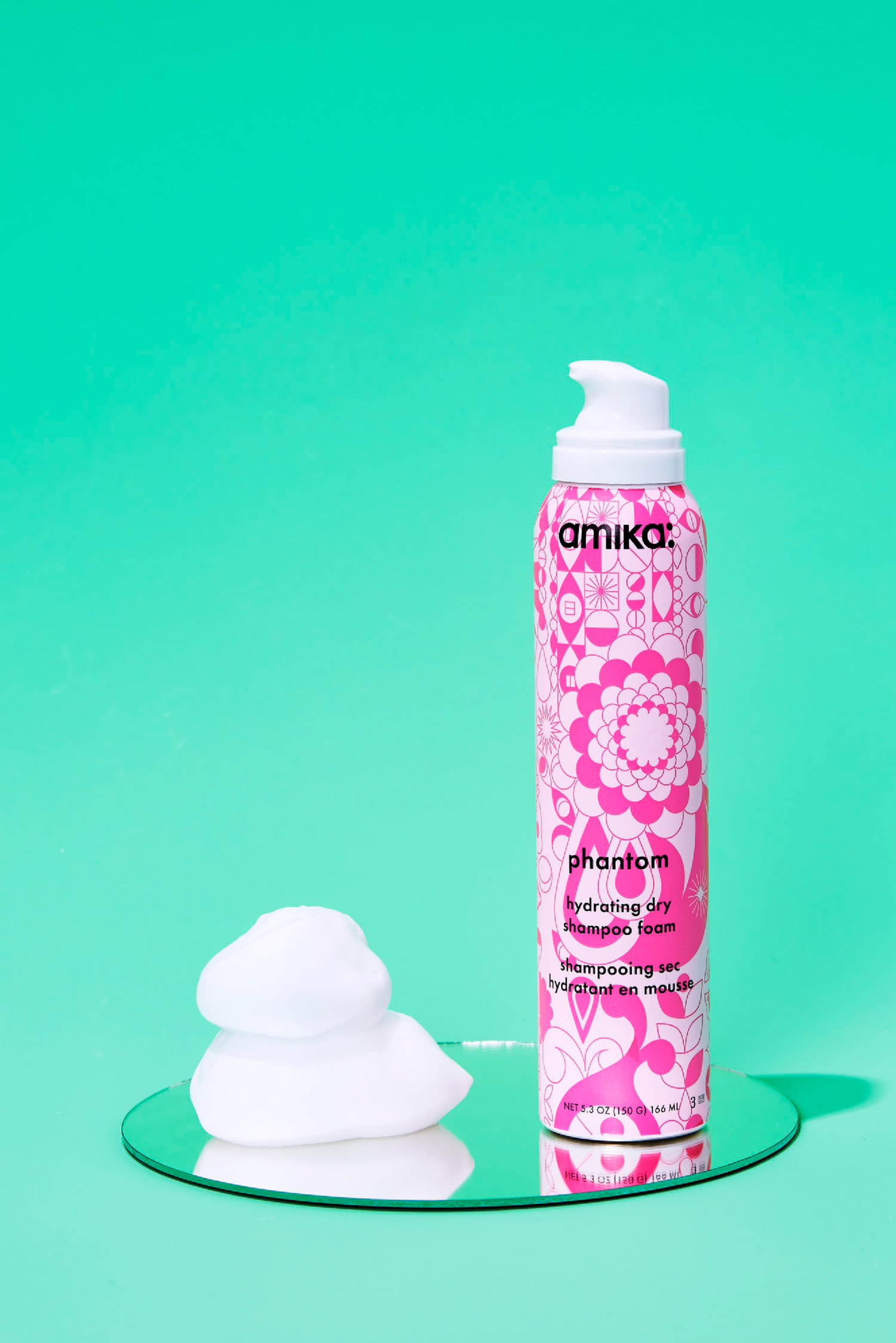
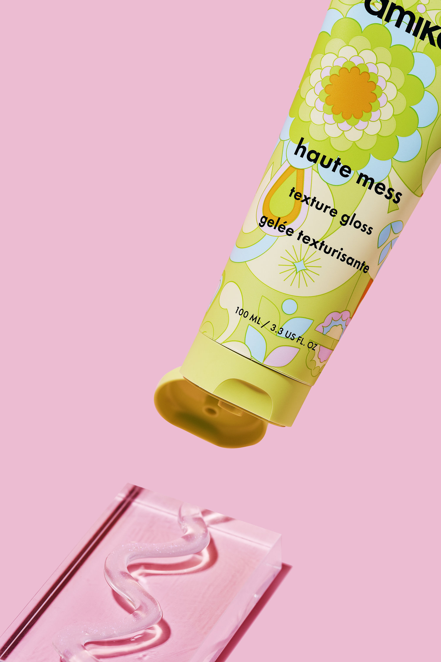
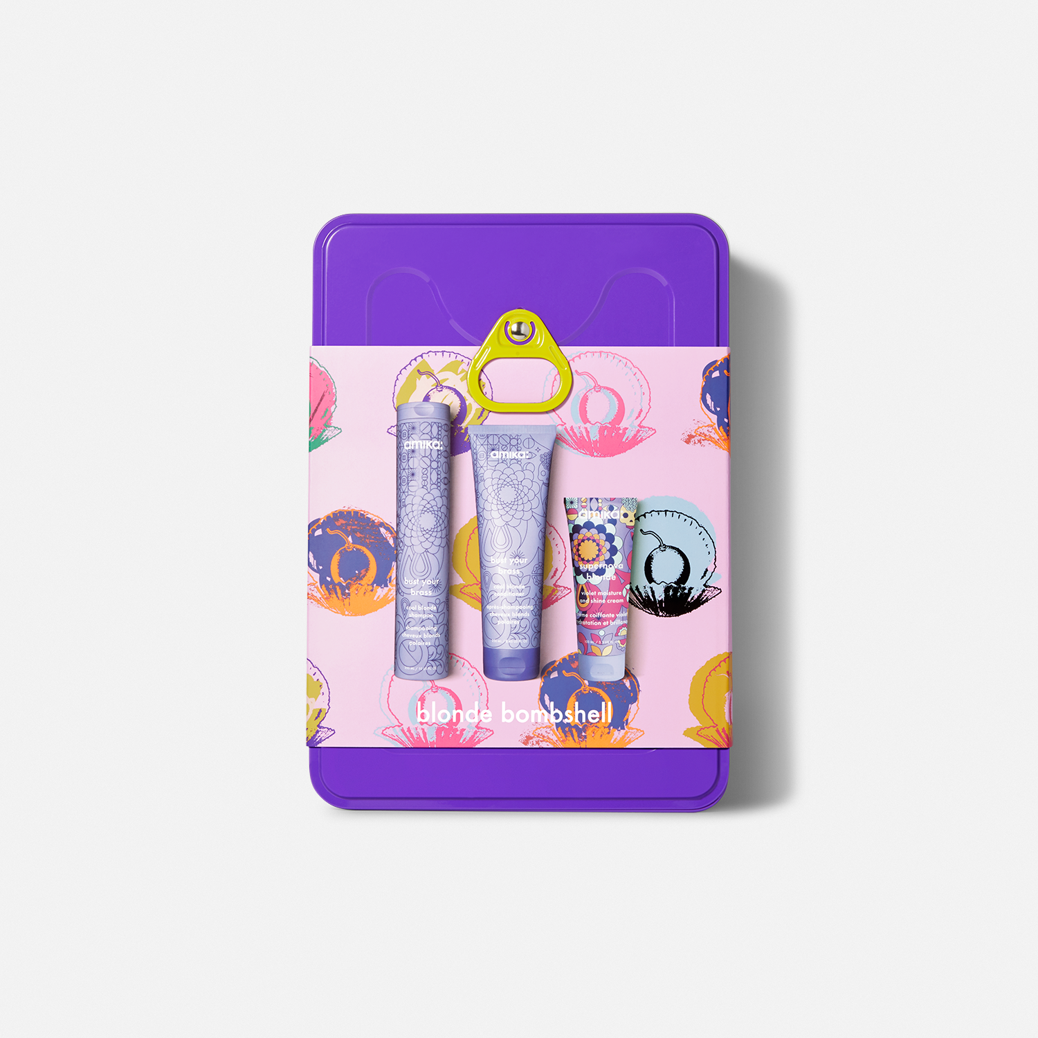
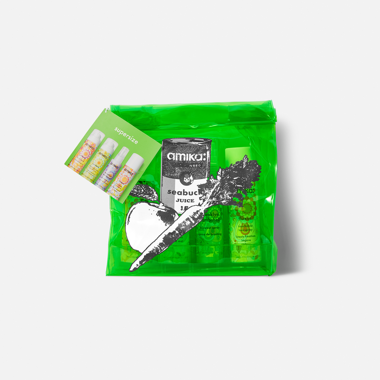
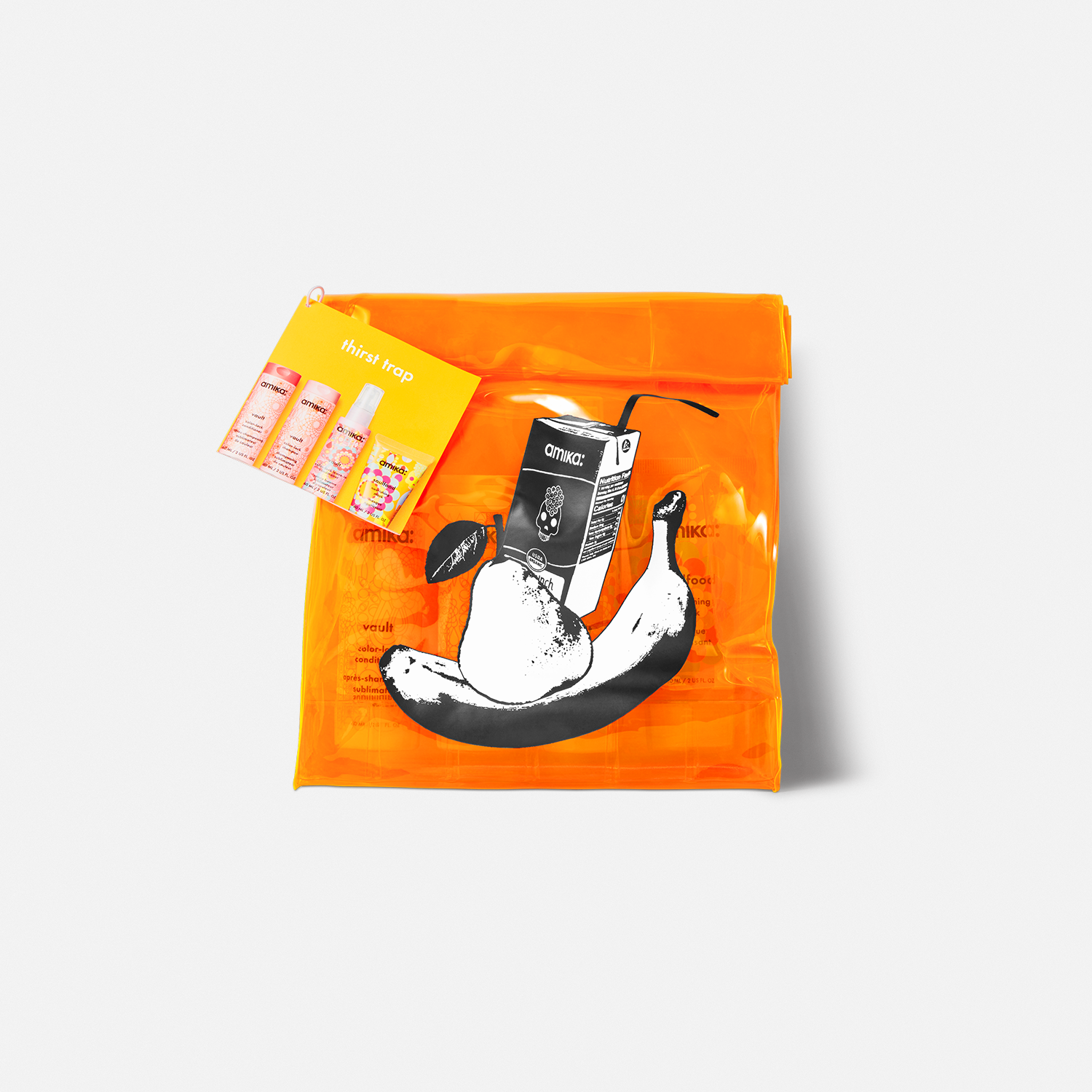
Tasked with creating a striking packaging system, I focused on developing bold patterns and vibrant colors that stand out on the shelves of Sephora and other mainstream retailers.
Through meticulous mockups and illustrations, I crafted a visual identity that embodies Amika's playful spirit and dedication to quality. This design not only captures attention but also resonates with the brand's ethos, ensuring that each product feels as fresh and inviting as the experience of using it. The result is a packaging system that not only pops but also tells a story—one that engages consumers and elevates the Amika brand in a competitive market.
︎︎︎ Project live on Amika’s Website
