KENT EXPRESS & HENRY SCHEIN DESIGN SYSTEM
- Web Design
- Design System
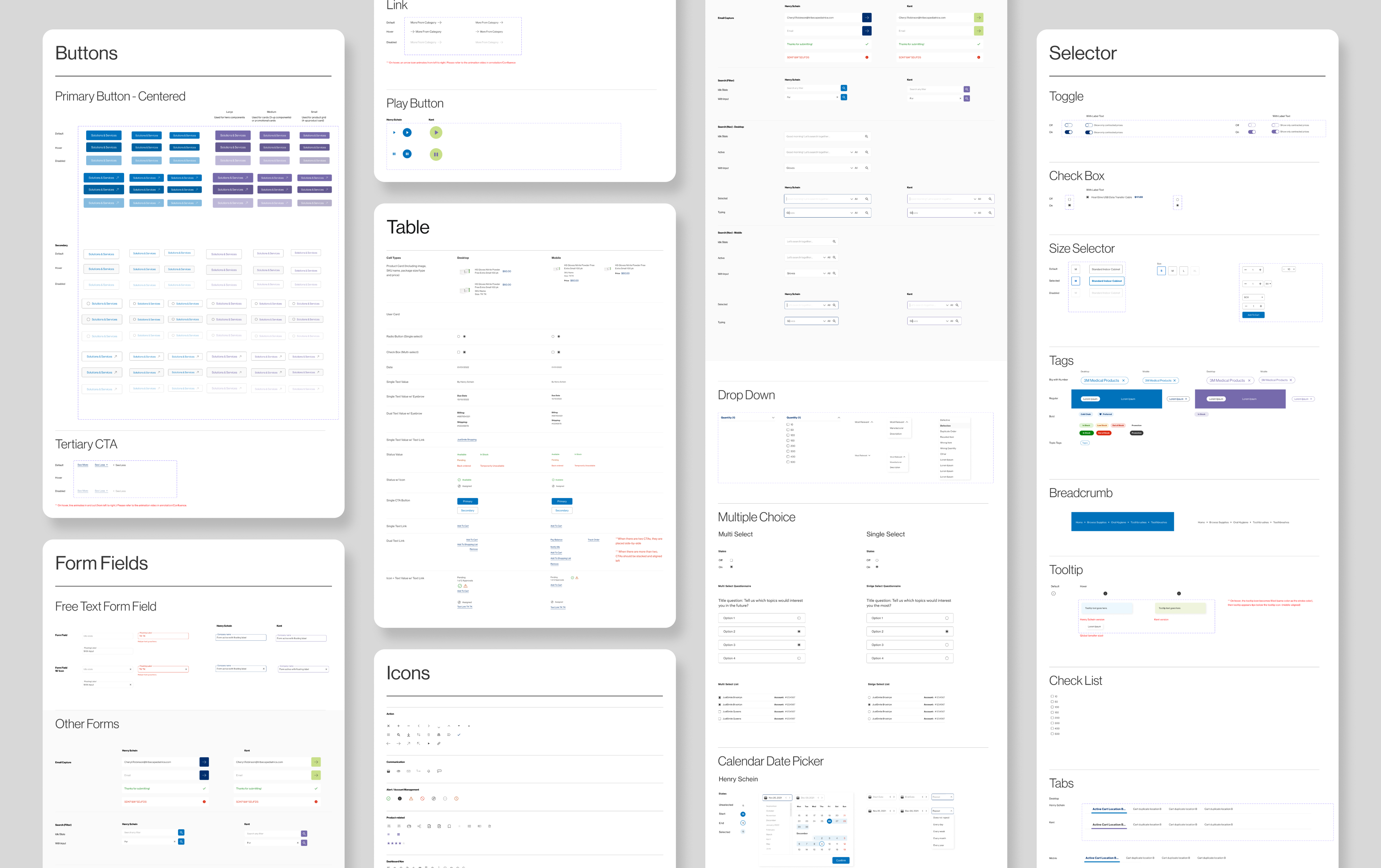
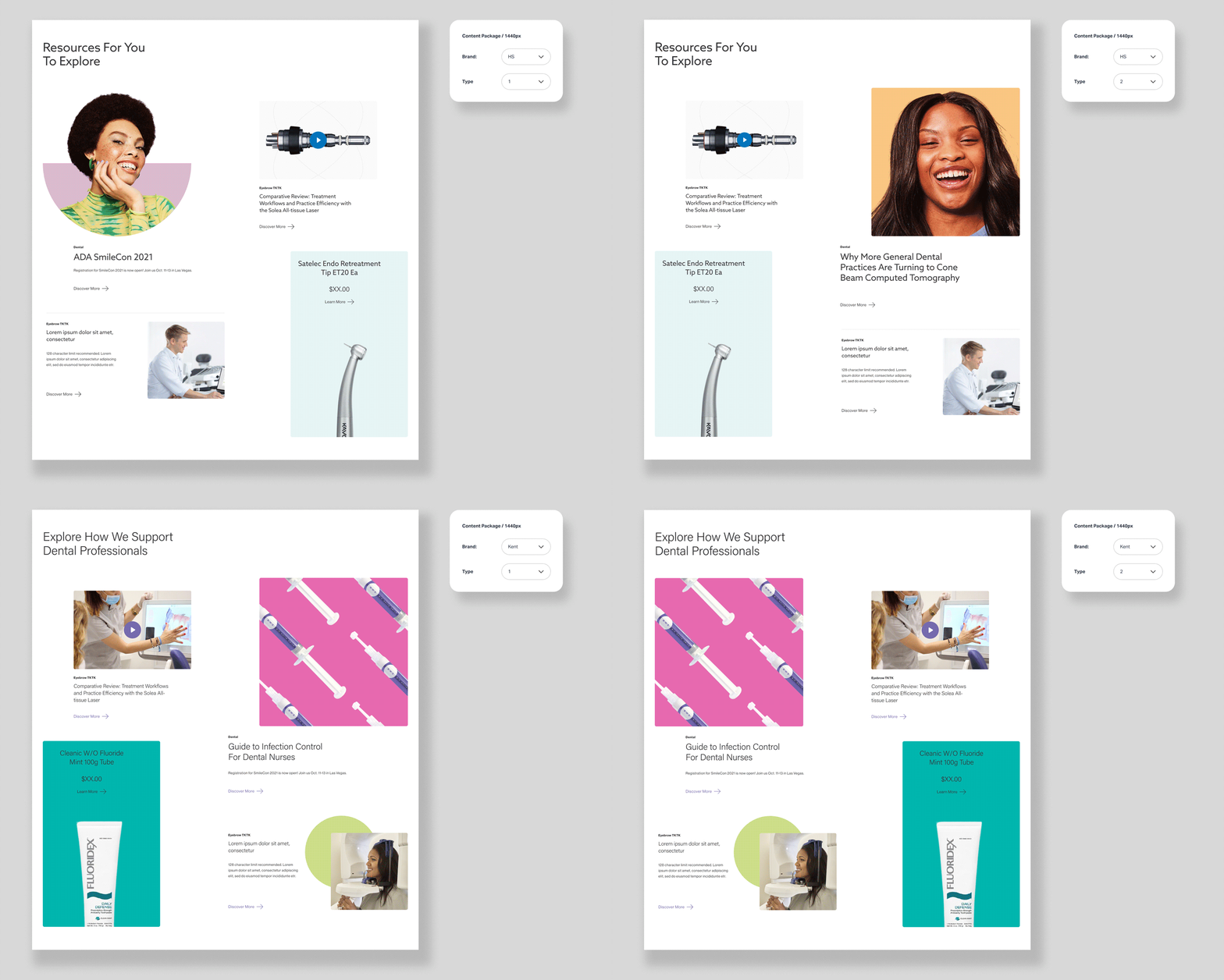
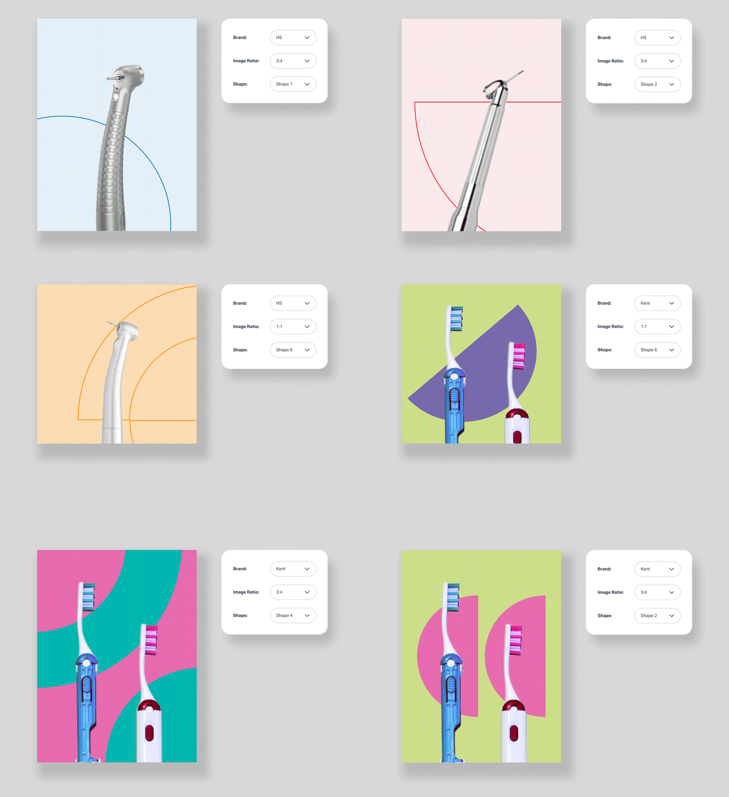
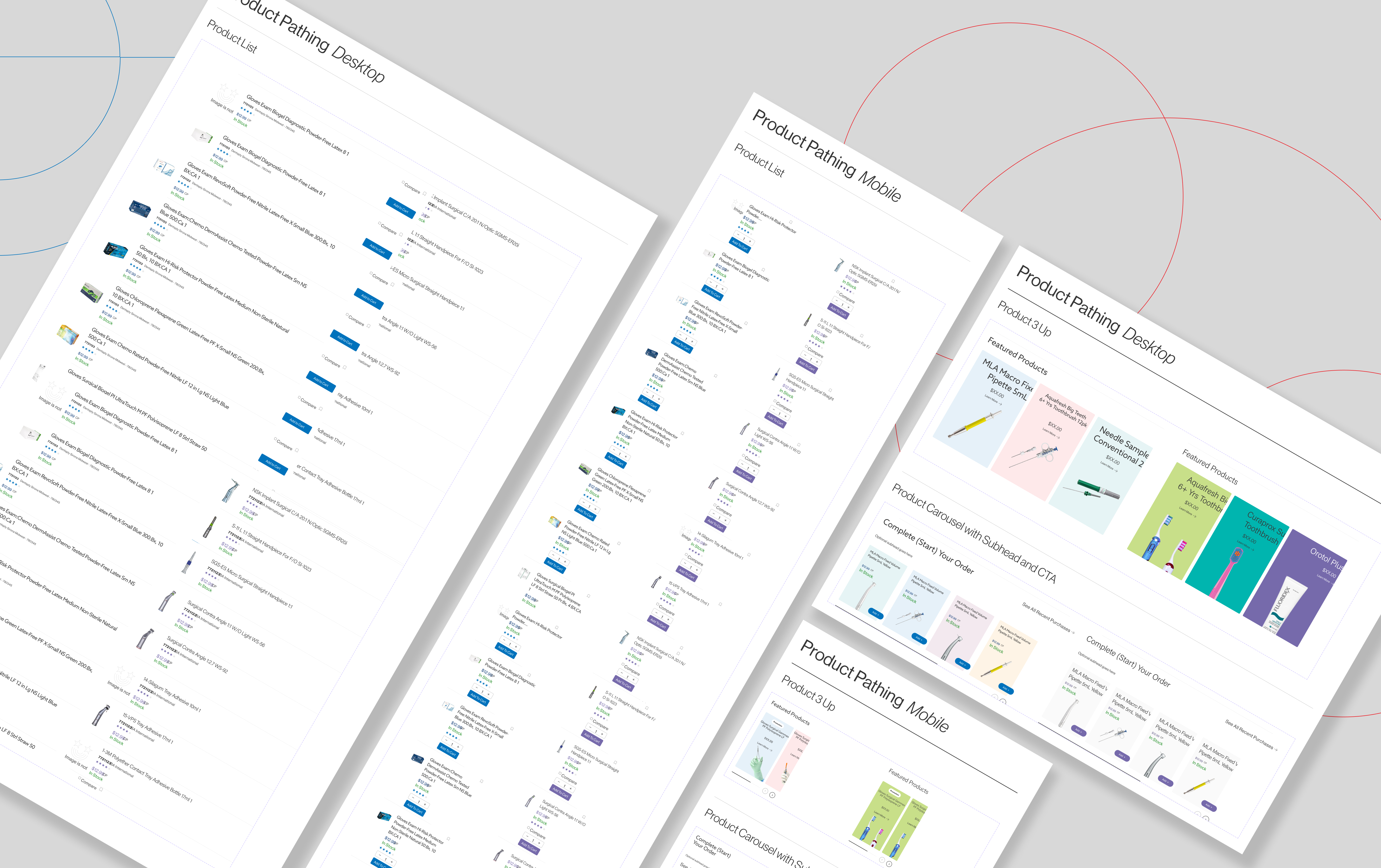
Tasked with building the largest and most intricate design system of my career within Figma, I created a unified, adaptable design system for both Henry Schein and Kent Express. Although the brands represent the same company across different countries and share a similar visual language, they each maintain distinct identities through unique color palettes, typography, and button styles. To seamlessly accommodate both brands, I developed a 1:1 design system with toggles and dropdowns, allowing effortless switching between every element across the brands. This project balanced cohesion with customization, ensuring each brand retained its unique feel while reinforcing their shared family identity.
︎︎︎ Kent Express Project Page
︎︎︎ Henry Schein Project Page
︎︎︎ Kent Express Project Page
︎︎︎ Henry Schein Project Page


